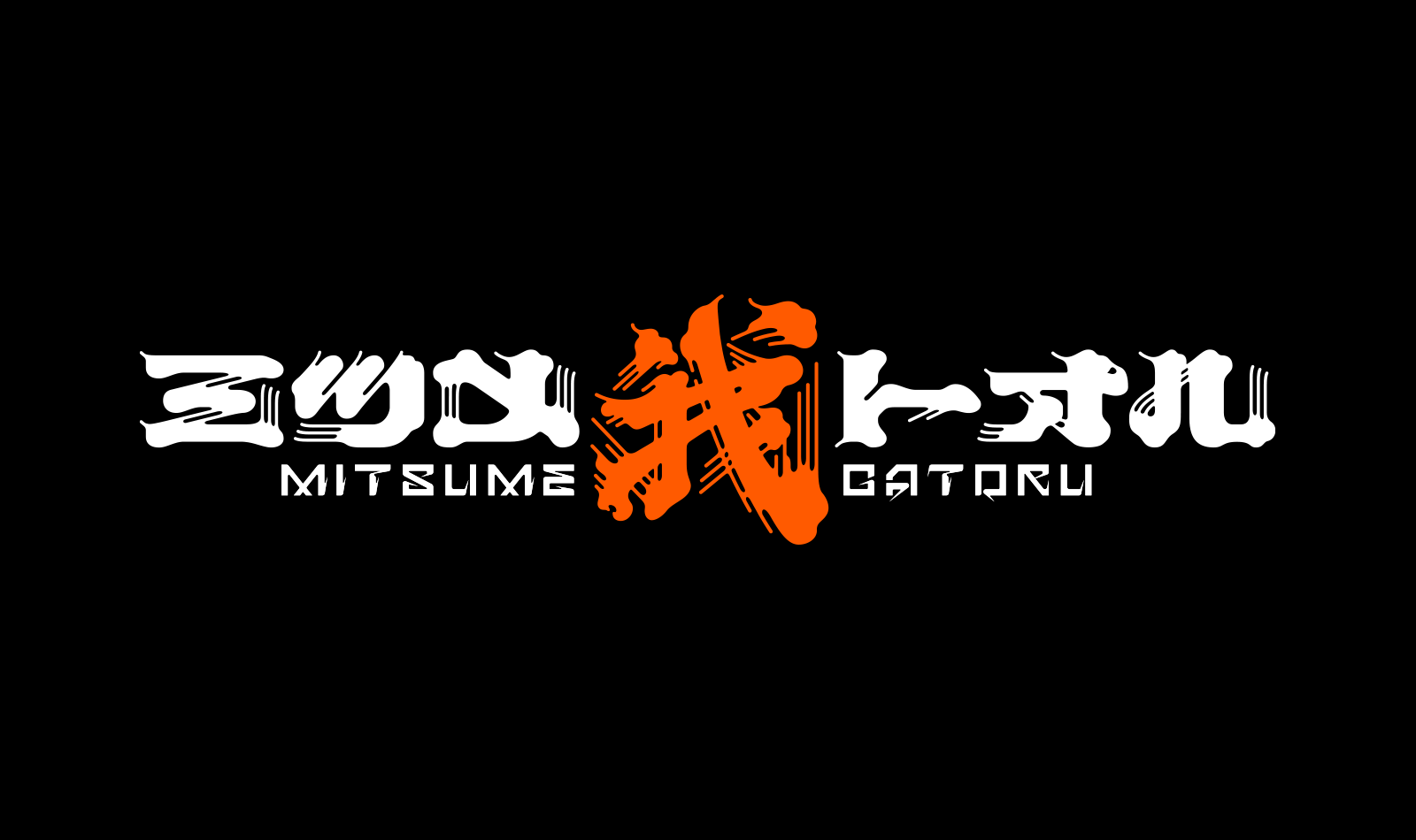
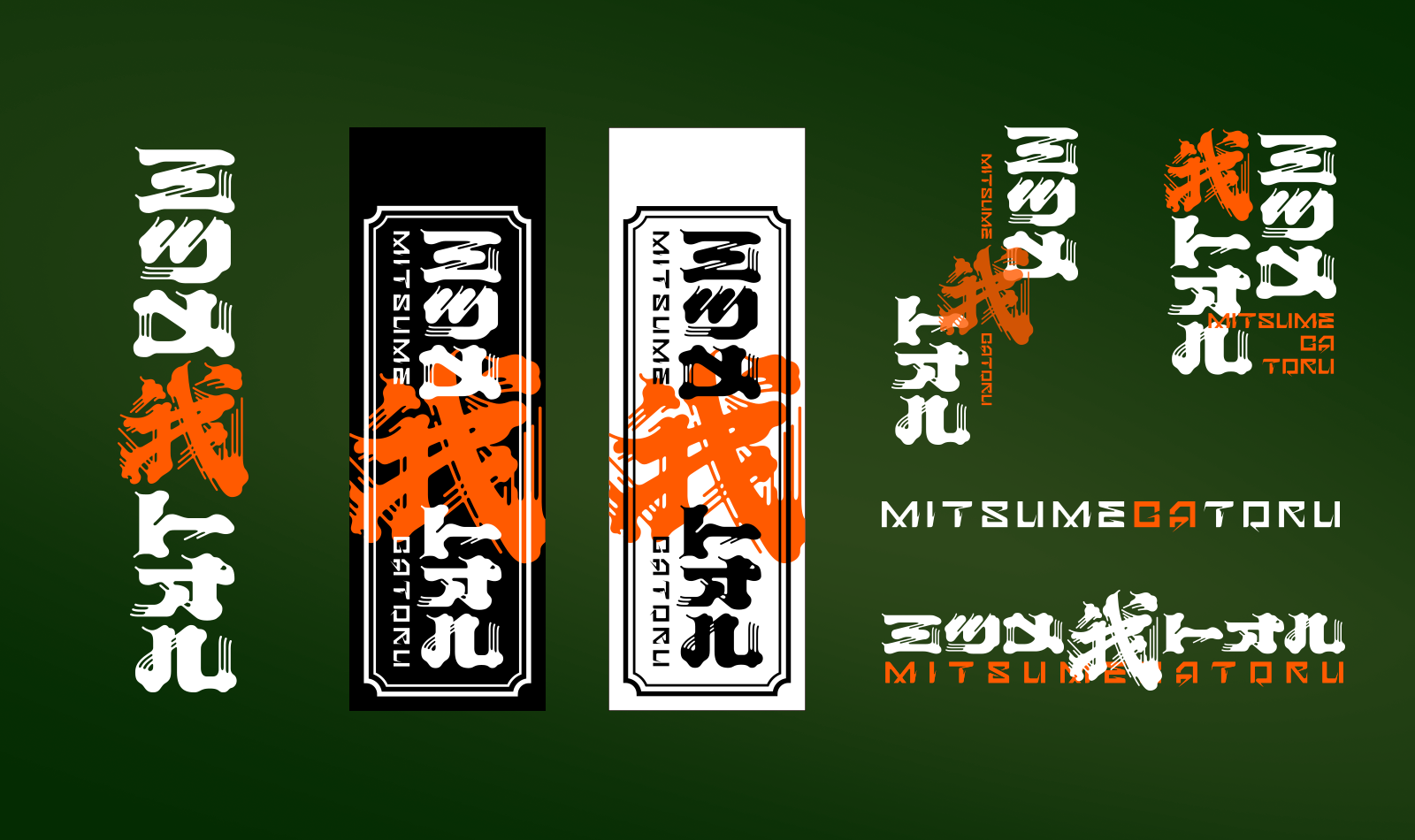
MITSUMEGATORU logo design
Logo design for a Japanese flower artist. The client's name, Mitsume Gatoru, carries a double meaning — both "the three-eyed one passes through" and a personal declaration of seeing beyond the surface. Inspired by Osamu Tezuka's legendary manga, we set out to build a mark that feels ancient, unsettling, and alive.
フラワーアーティストのロゴデザイン。
「三つ目がとおる」ーー手塚治虫の伝説的漫画から引用され、同時に作家自身の存在宣言でもある。表層を見透かす眼、花に宿る妖気。このロゴは日本固有の怪しさを纏ったブランドシンボルとして設計された。
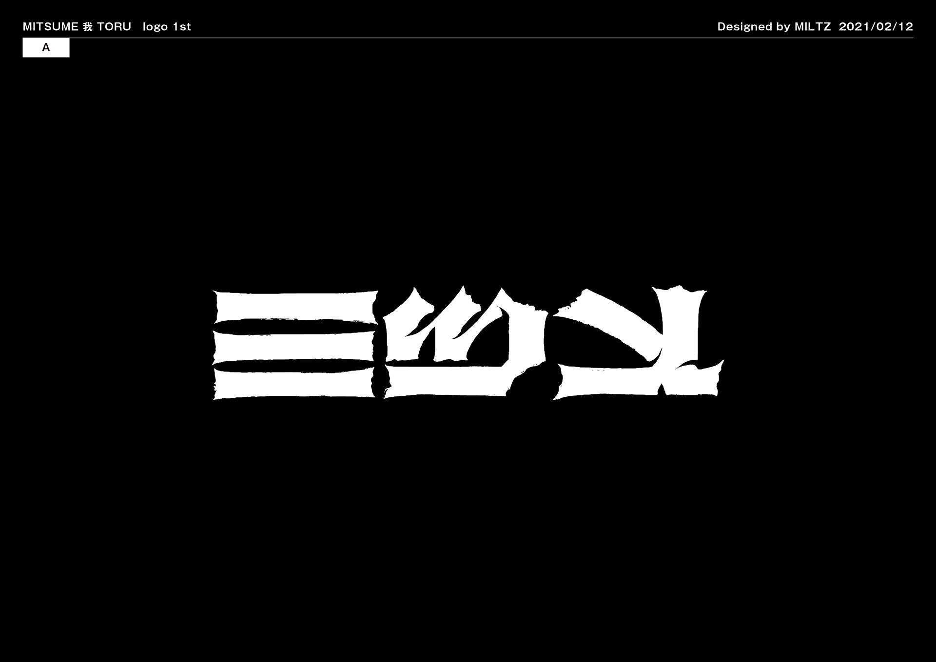
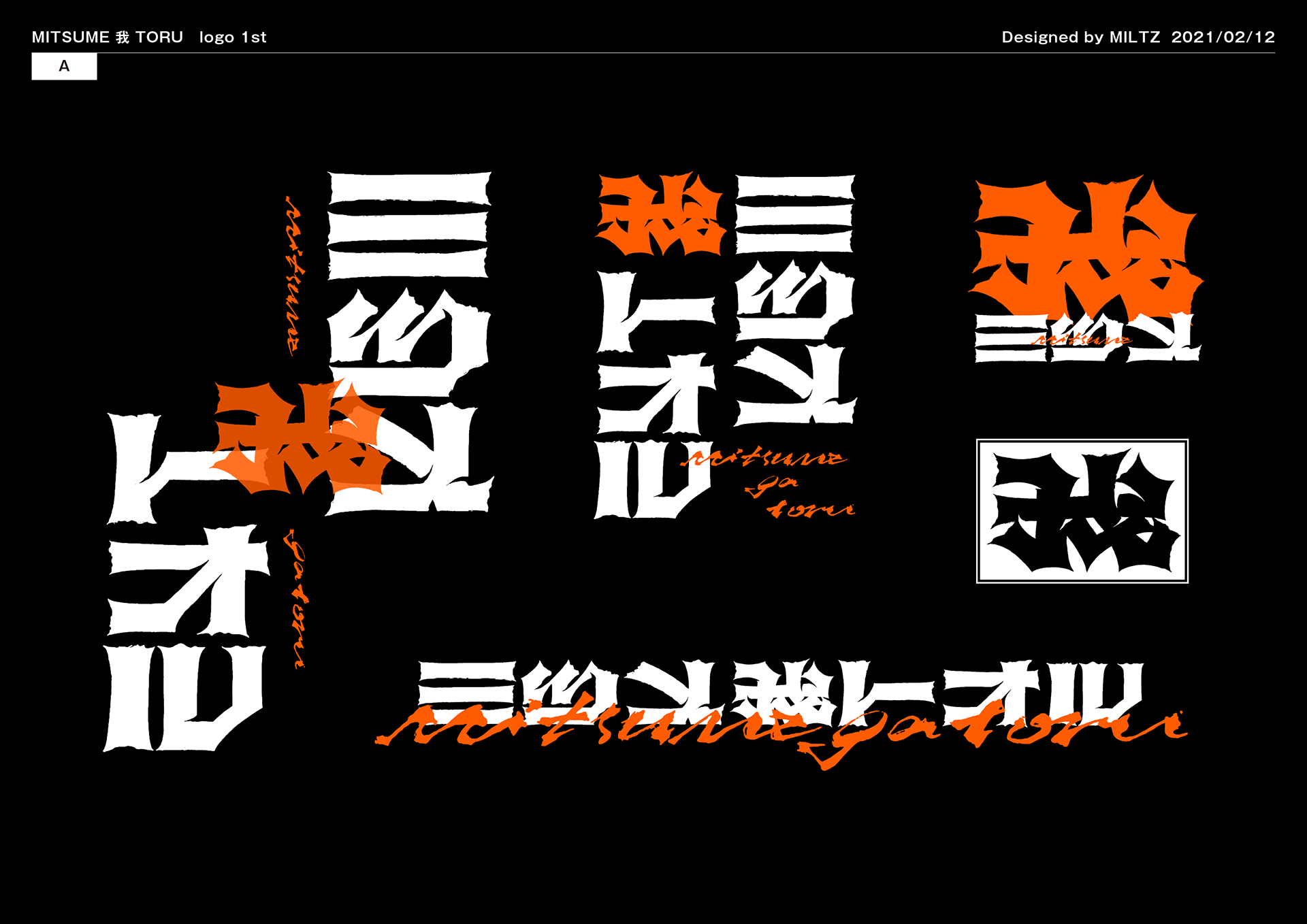
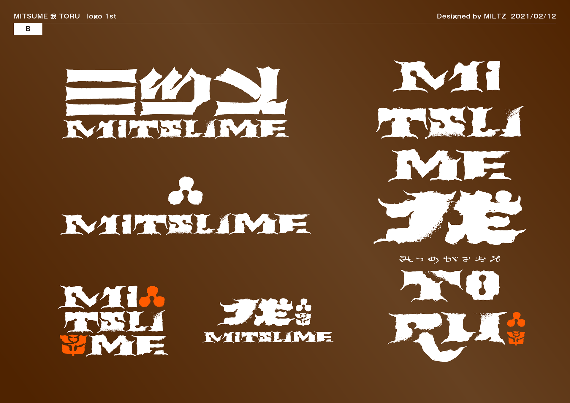
1st proposal
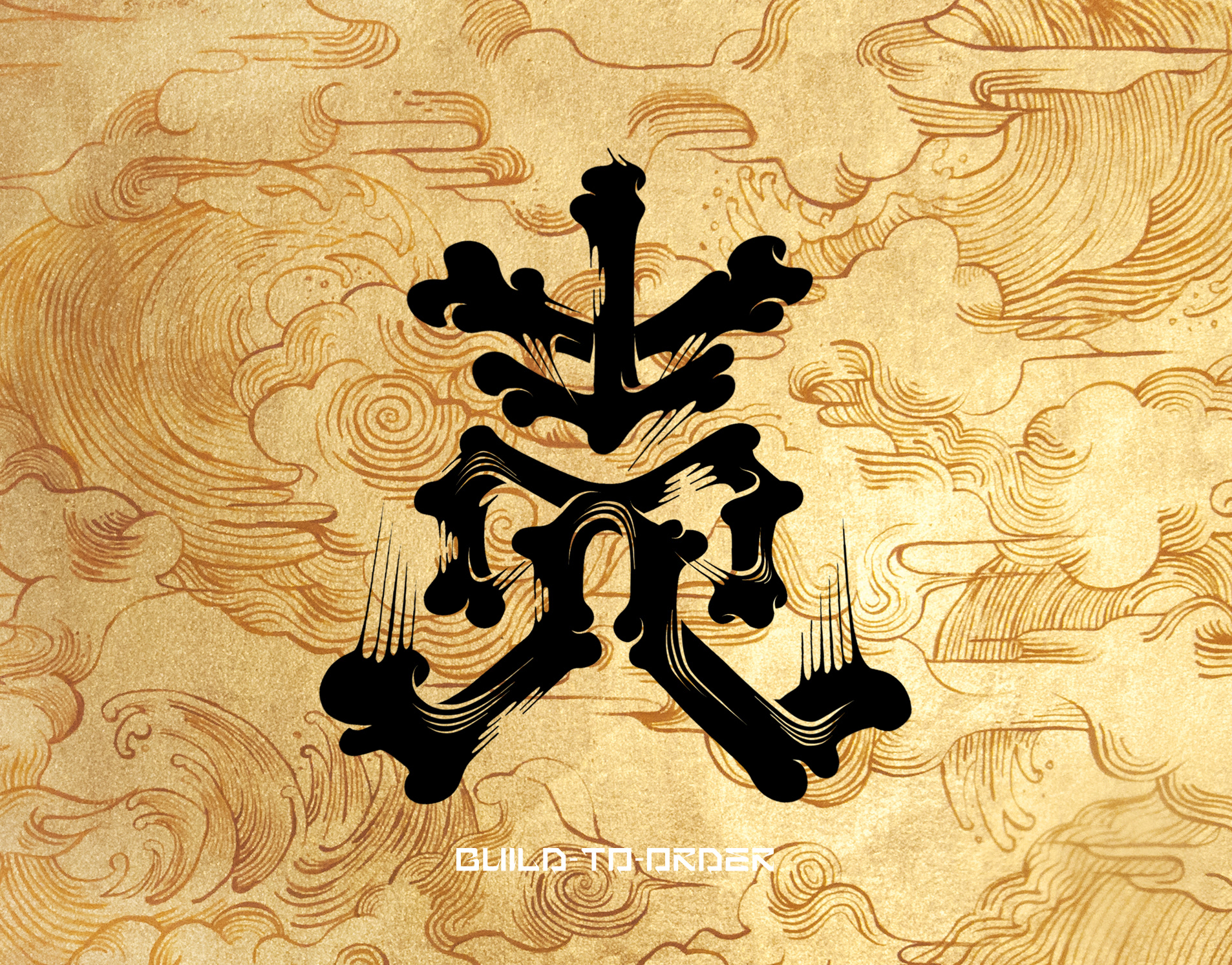
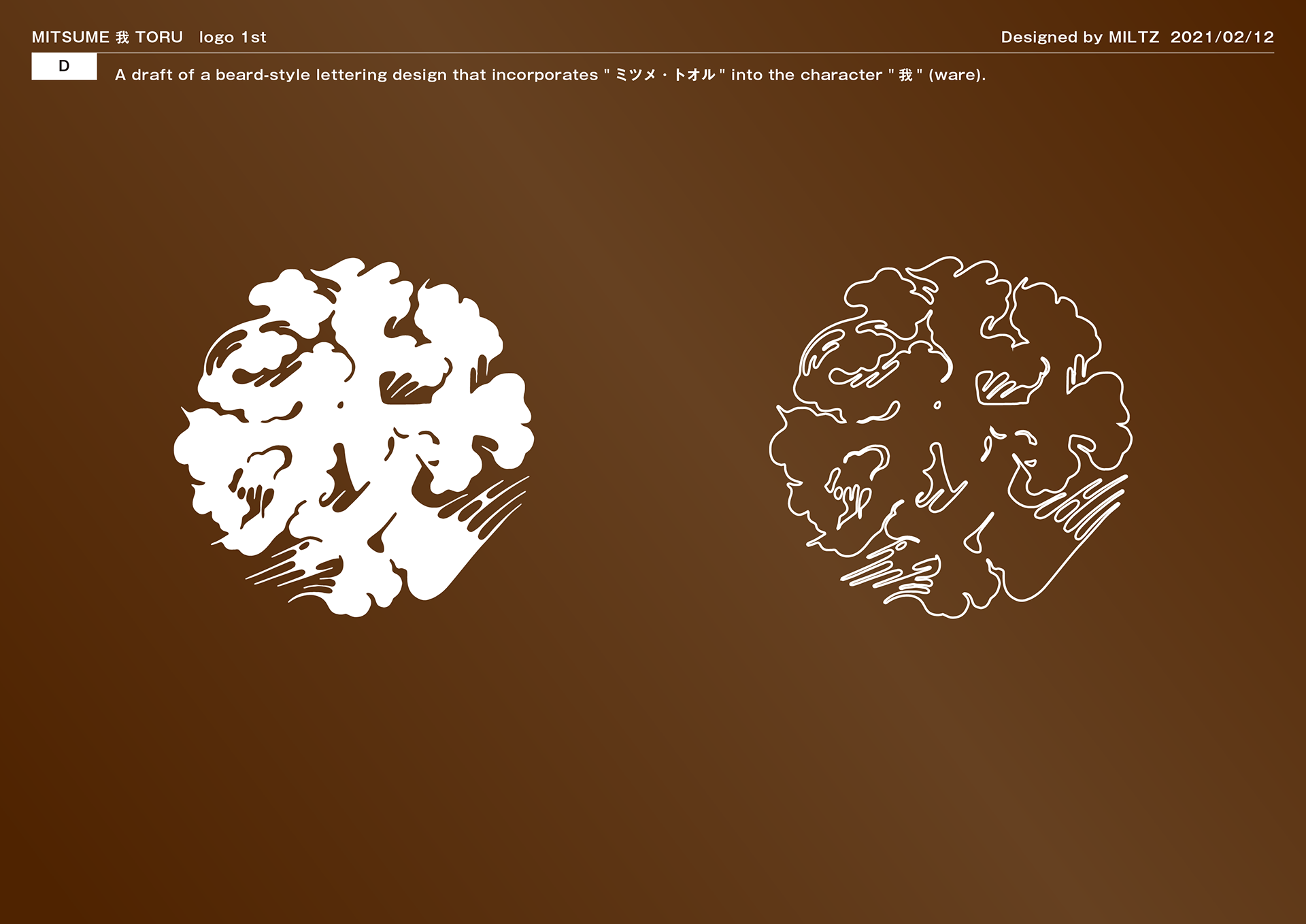
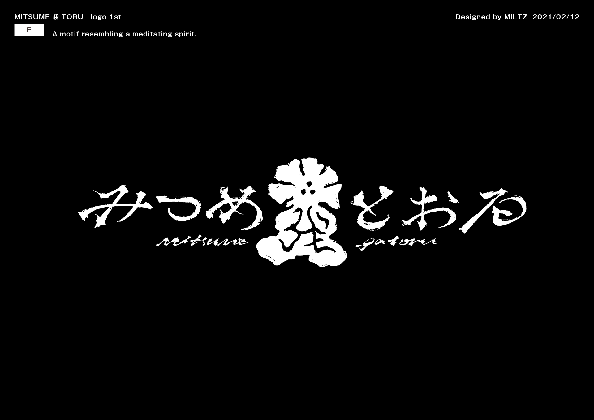
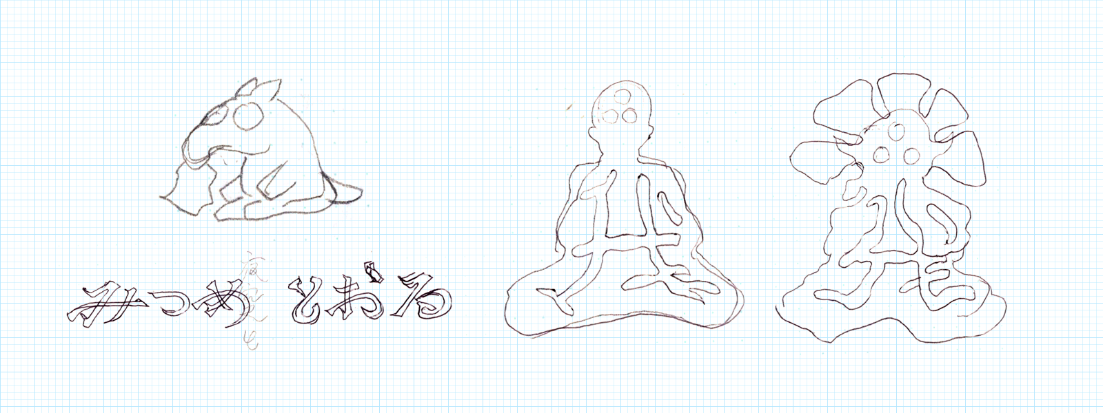
The concept hinges on three elements: the eye, the flower, and the self. The kanji 我 (ga / "self")
sits at the heart of the mark, redrawn as a flower — the character itself transforming into something botanical.
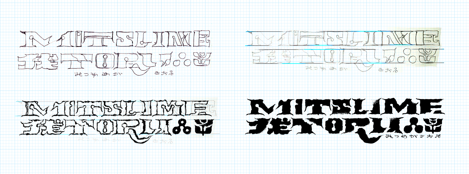
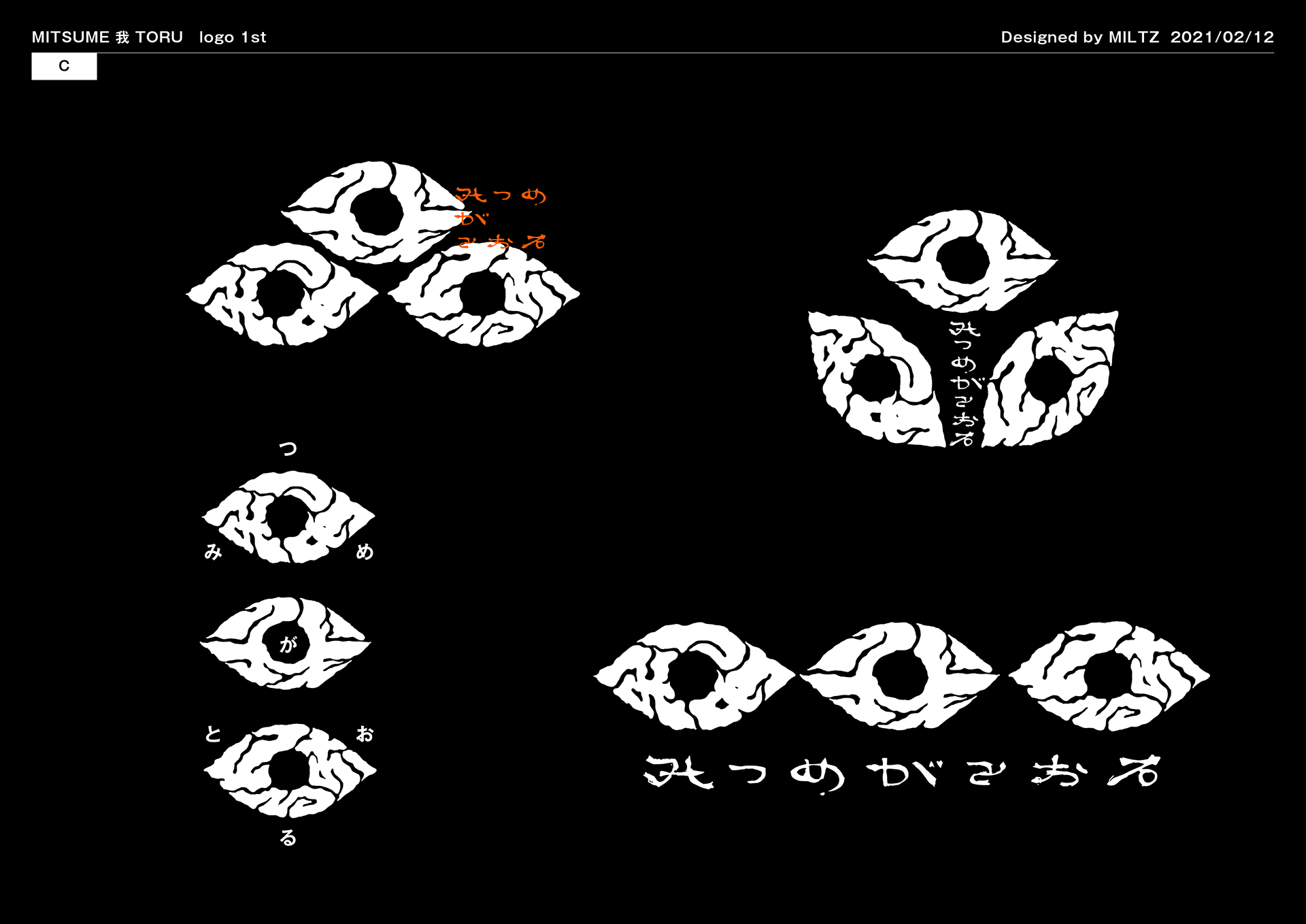
Early explorations tested the boundary between legibility and menace. A tension emerges between the globally readable and the culturally specific.
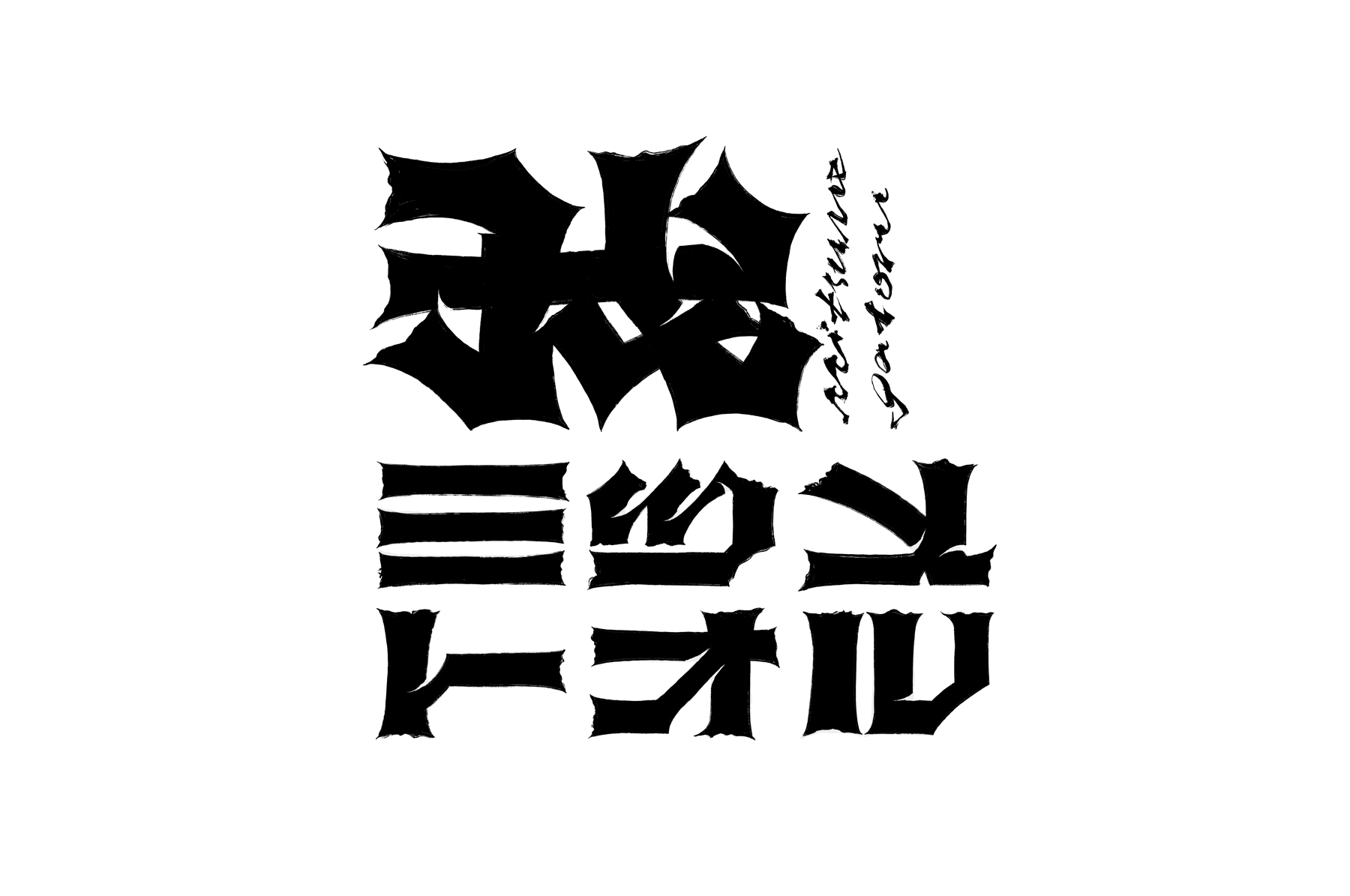
Directions included: 我 redrawn as a monk-like floral figure, the characters themselves becoming three eyes, letterforms dissolving the line between Japanese and Latin, and brush treatments carrying an almost occult weight.
Each approach asked the same question — how strange can a logotype get before it stops being useful, and how useful can it stay while still being strange?
コンセプトの核は3つの要素 眼、花、我。
漢字「我」はロゴパーツの中心にある花として描画する。
初期の探索は、可読性と不気味さの境界線を試すところから始まった。
グローバルに読めるものと文化的に固有なものの間に緊張感が生まれる。
我を花の僧のようにキャラクター化する案、文字そのものを三つの目とする案、日本語と欧文の境界を溶かすレタリング、ほとんど呪術的な重さを持つ筆書き処理。
それぞれのアプローチが同じ問いを投げかけていた――ロゴタイプはどこまで奇妙になれるか、そして奇妙であり続けながらどこまで機能できるか。


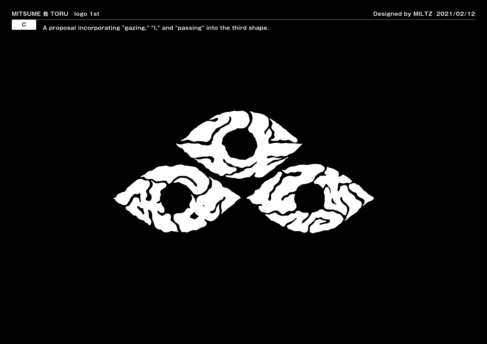
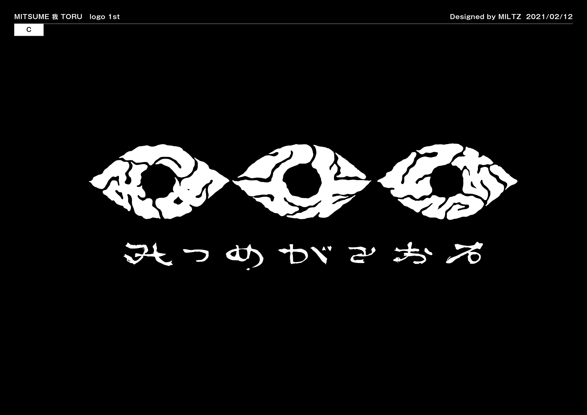
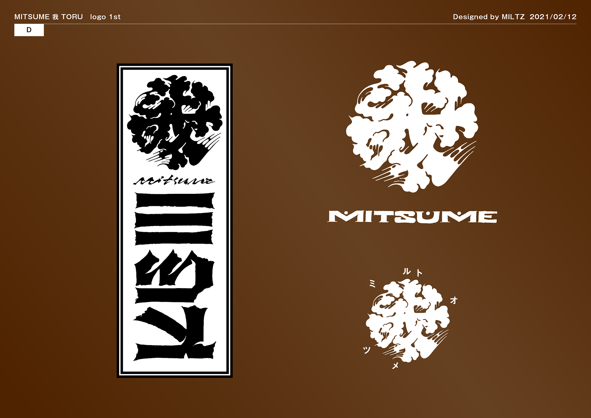
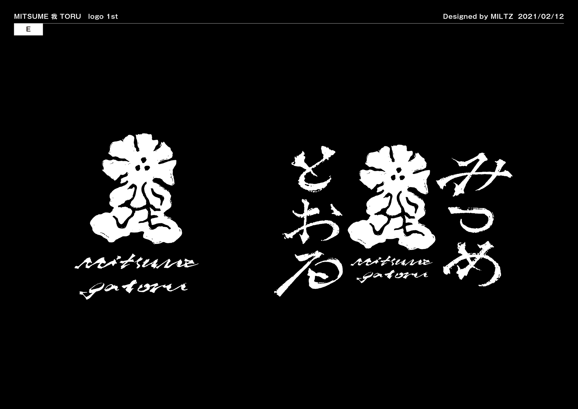
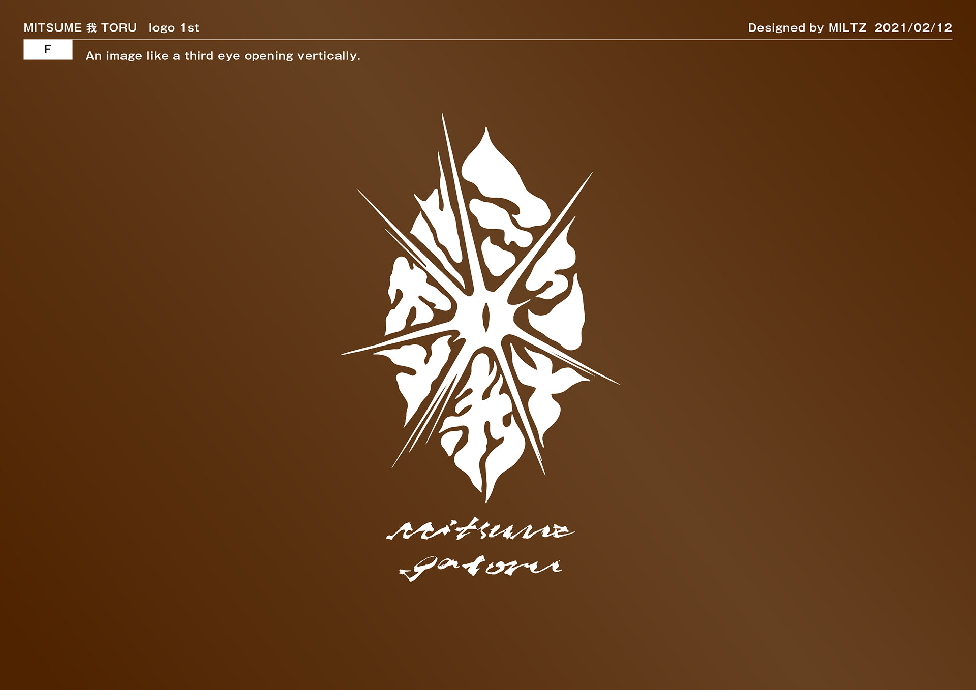
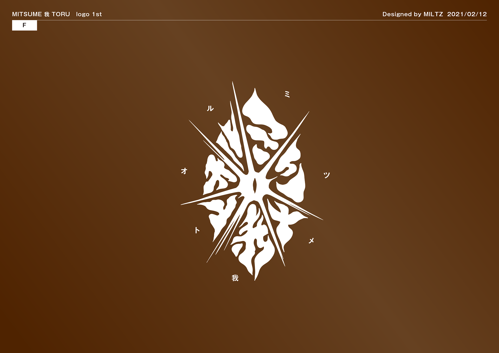
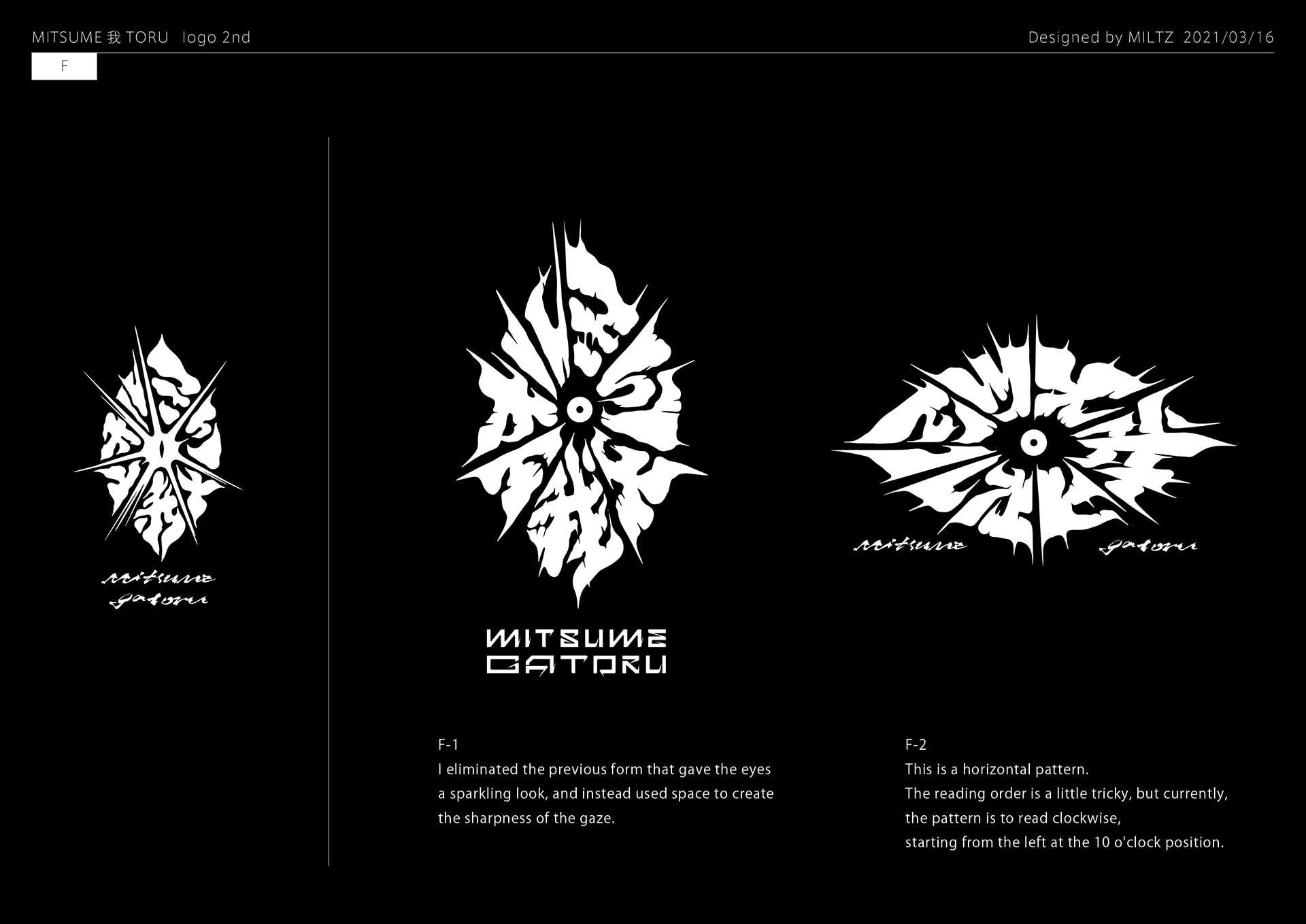
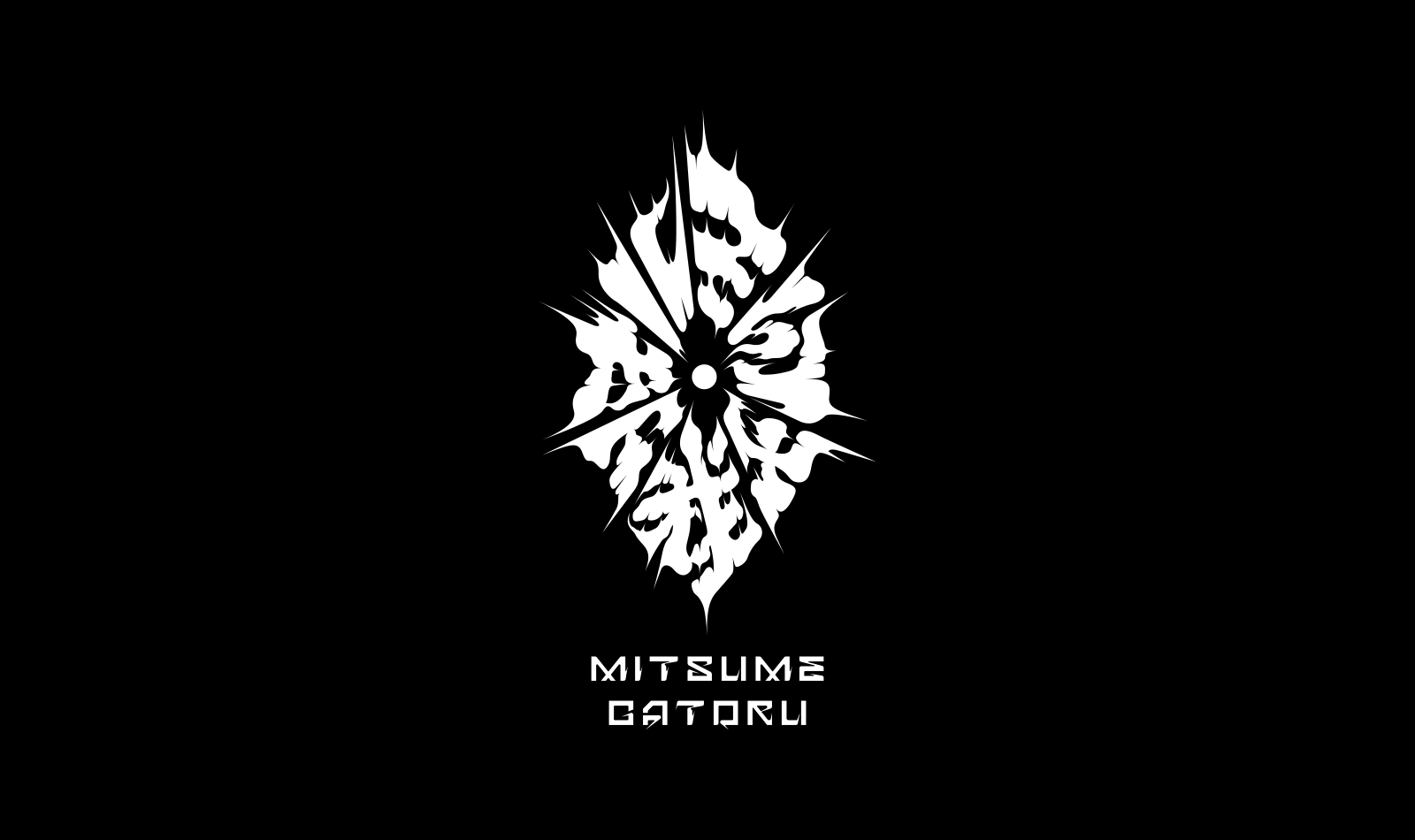
The emblem is built from overlapping eyes and petal forms — neither fully botanical nor fully figurative. It reads differently at different scales: as a chrysanthemum from a distance, as a cluster of watching eyes up close.
This duality is the point. The flower artist works with beauty that has edges. The logo should do the same.
完全な文字でも、完全な具象でもない。遠目には菊のように見え、近づくと見張る眼の集合体として現れる。この二重性こそが核心だ。フラワーアーティストは、棘のある美しさを扱う。ロゴもまた、そうあるべきだった。
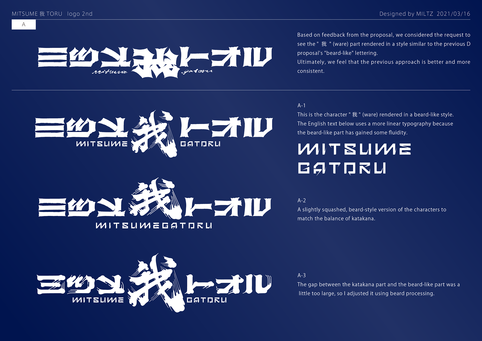
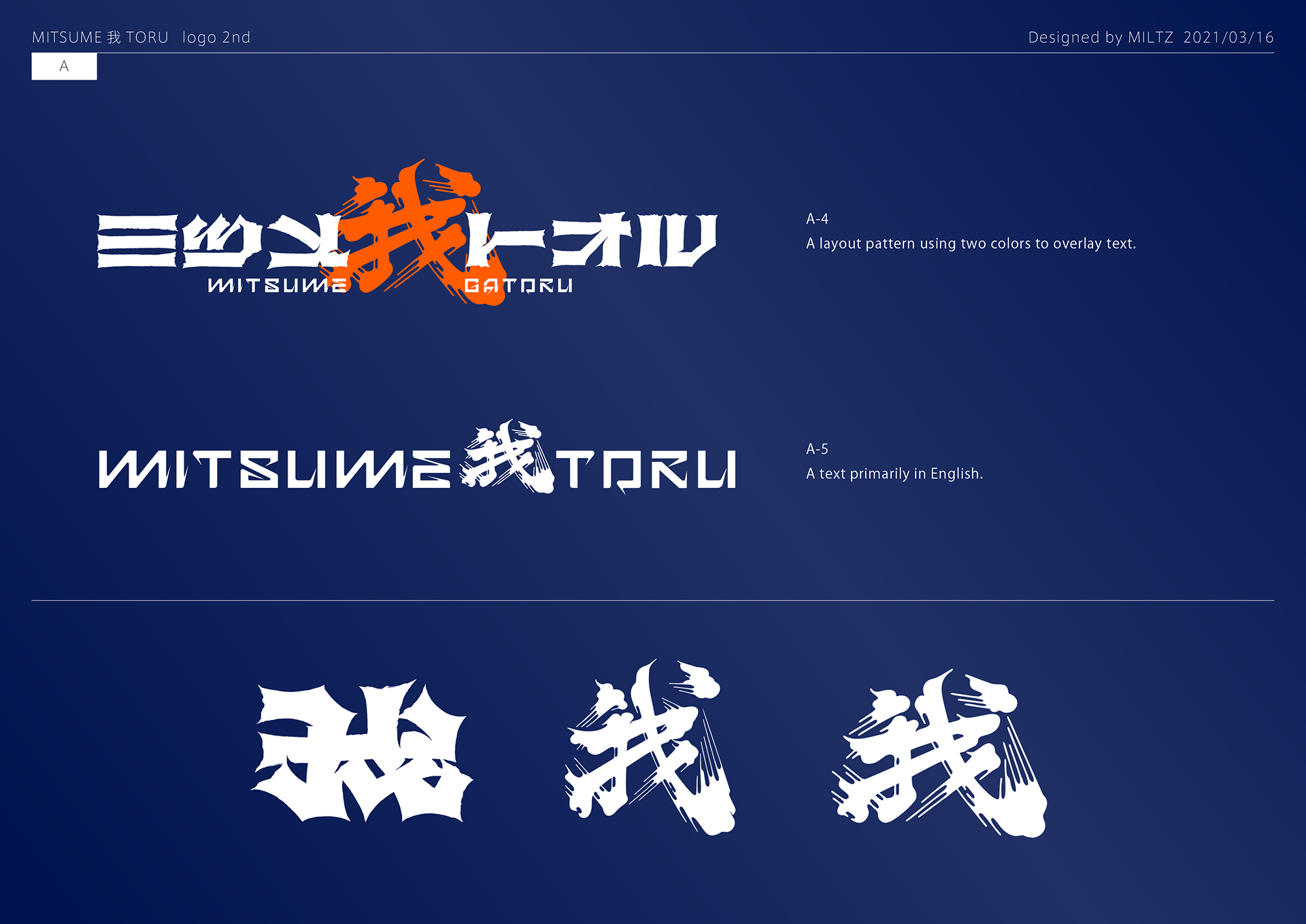
2nd proposal
.